The Dell Technologies homepage experience has been ever-changing, ever challenging. Upon my hiring, I was immediately brought into the homepage core team. First as copy lead, then became a member of the homepage optimization committee/team, to now leading the entire homepage content governance and experience strategy for the organization.
But we all know full well that 2020 was an extraordinary year; we catapulted into an virtual-only world overnight. Escalated business requests were coming in — left, right, up, down — for delltechnologies.com homepage placements, and customized additions were being published to align with the business all while disrupting the user journey/experience. At the time, we were just keeping our heads above water, but we knew we were placing Band-Aids on a greater issue, and the longevity of these solutions wouldn’t stick with our users. Something had to give.
My colleague, a principal designer, and I spearheaded this vision for a new homepage to create an exceptional experience for our team, the business and most importantly, visitors and users, alike. Together, we pitched our concept to our direct leadership, Vice President of Digital Marketing, to finally our overarching group of Senior Vice Presidents whom all (enthusiastically) gave us the green light. This led to positive, user testing sessions which led us to push a live A/B test recipe we executed with our audiences in EN-UK (100% of all traffic), EN-AU (100% of all traffic) and EN-US (30% of all traffic).
The results? Stunning — and without question — in our favor.
88% lift of exposure rate on homepage views for B2B-related content
154% lift of exposure rate on homepage views for Brand-related content
182% lift of exposure rate on homepage views for the Contact Us module
32% increase in story contact interaction rate (click-through rate)
20% increase in contact us submissions
Take a deep dive into the new and improved live DellTechnologies.com homepage.
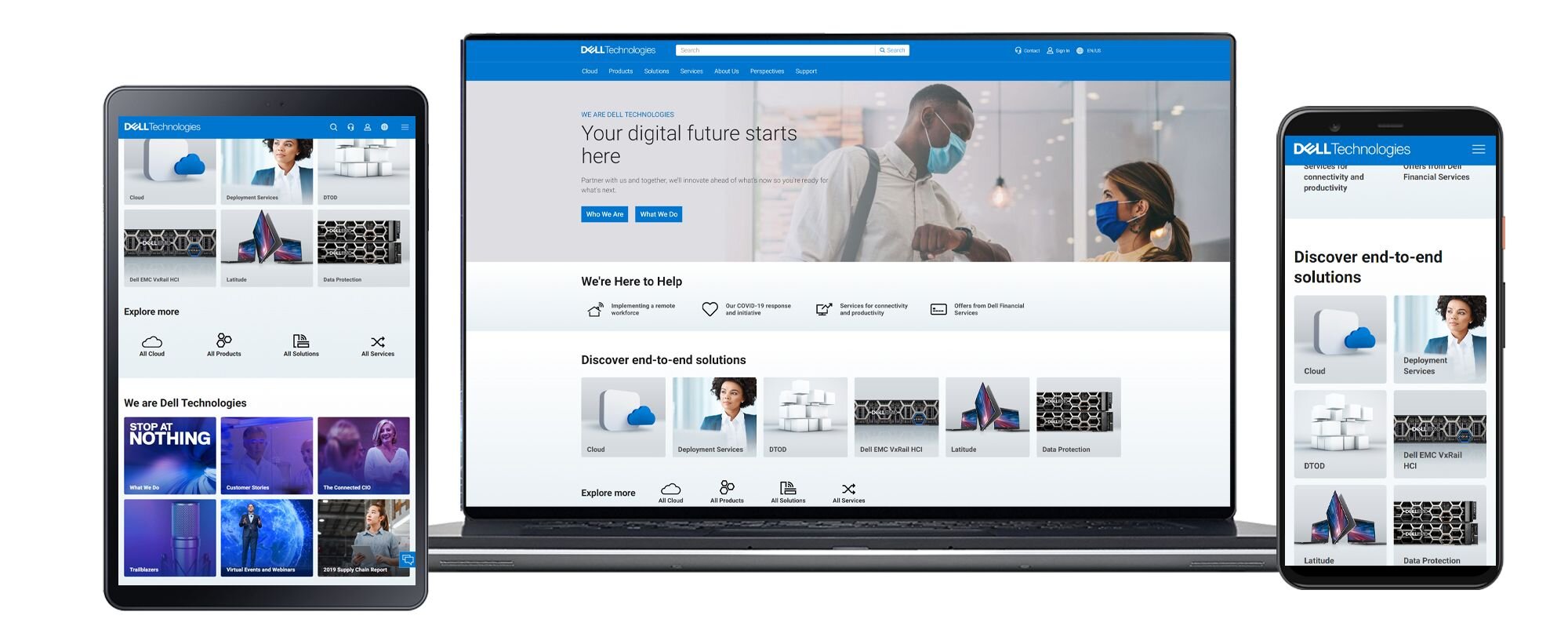
Simple, streamlined tiles giving a more app-centric, navigation-like approach to content. First and foremost, our users are drawn to the site navigation (70% of our traffic; an industry standard), so this design is a play on navigation-meets-landing-page.

Our users don’t have time to scroll, therefore they don’t (on desktop, anyways). We took a radical approach by reducing the scroll by more than half. Our entire end-to-end solutions portfolio (products, solutions, services) and We are Dell Technologies (corporate, podcasts, events, reporting) content are now visible within a single scroll below the hero, giving our users a true view of everything available to them in a single glance.
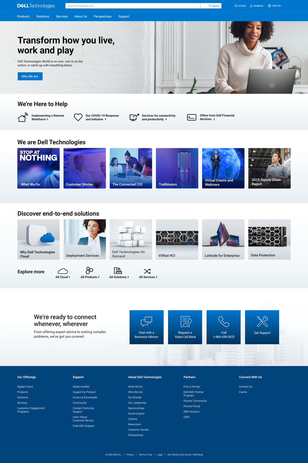
This layout is flexible enough to scale across all shapes and sizes of screens without losing its intended purpose or interactive capabilities.

One of the most crucial problems we had to solve for was building a design that was a flexible, modular architecture so we could purposefully disrupt content for business needs such as a product launch or an event. Yes, there would always be a standard layout, but this particular component would support multiple views, multiple layouts that would allow us to populate content without hard-code customization (what we do to-date). This newly cultivated wiggle room lets us interrupt the experience with care and levels of hierarchy to guide users’ attention to the latest, greatest piece of content.

Another hurdle we solved for was supporting a successful global experience. The business to-date hasn’t solidified a strong yet simple resolution around accommodating homepage content globally, so we brainstormed meticulously on how we could solve for this once and for all. This 2.0 experience allows the page to publish globally with the component automatically creating translation and regional rollout. Content will be readily tailored and customized for the needs of one specific region. In this scenario below, the business has a corporate campaign going live in all locales except Japan. With this design, we can change the component view for just the Japanese homepage while leaving the English experience untouched.

All in all, my principal designer and I drastically transformed the homepage experience, and for all the right reasons. The name of the game was strategy, eliminating ambiguous imagery and content “fluff” to get right down to it in a single scroll across all platforms. Plus, our stakeholders were able to get more of their content to our users, quicker and easier, with more flexible options we could tailor to their specific business needs (needless to say, they’re ecstatic). The proof was in the pudding; the verdict was favorable in unmoderated and moderated user testing and the live test exceeded our KPIs tenfold. This is a huge success for everyone involved, the business and the user experience. This all led to a swift, seamless and exciting launch on Tuesday, April 6, 2021, and we look forward to what the future of the homepage holds even further and how we’ll continue to learn and adapt our strategy in the years to come.
